Starting to use the Spatialball package
Derek Corcoran, and Nicholas Watanabe
2020-11-09
1 Introduction
The Spatialball project was developed to analyze and visualize spatial data in the NBA. We can separate the Spatialball functions into three groups:
- Data scraping
- Data visualization
- Data analysis
The SpatialBall package has only the visualization capabilities of the project, and it has been thought mainly as a demo, and it comes with the full dataset of the 2016-17 season. The full software version was build for reasearch and consultancy. Its documentation can be found here, if you want to ask about the SpatialBall2 package you can e-mail Derek Corcoran (derek.corcoran.barrios@gmail.com) or Nick Watanabe (nickwatanabe8@gmail.com)
library(SpatialBall)1.1 Data visualization
We have three levels of data visualization with graphs at the player, team, and league level. We will go into detail in each of those categories. First for players and all other levels of visualization we have shot charts. In our shot charts (see Fig. 1 as an example) the color scheme will be a scale of the points per shot or percentage depending on the options you choose. The size of the hexagon in shot charts represents the frequency of the shots taken, by the league, team or player, with bigger hexagons meaning a higher frequency of shots. Now we will go in detail into each of the visualizations available in our package.
1.1.1 Player level visualization
1.1.1.1 Player shot charts
For any given player that played in the league on a given season, you can build shot charts. The main function to do that is ShotSeasonGraphPlayer, in its most basic configuration, you only need to use the parameters Seasondata and the name of the player, as seen in figure 1.
data("season2017")
ShotSeasonGraphPlayer(season2017, player = "Stephen Curry")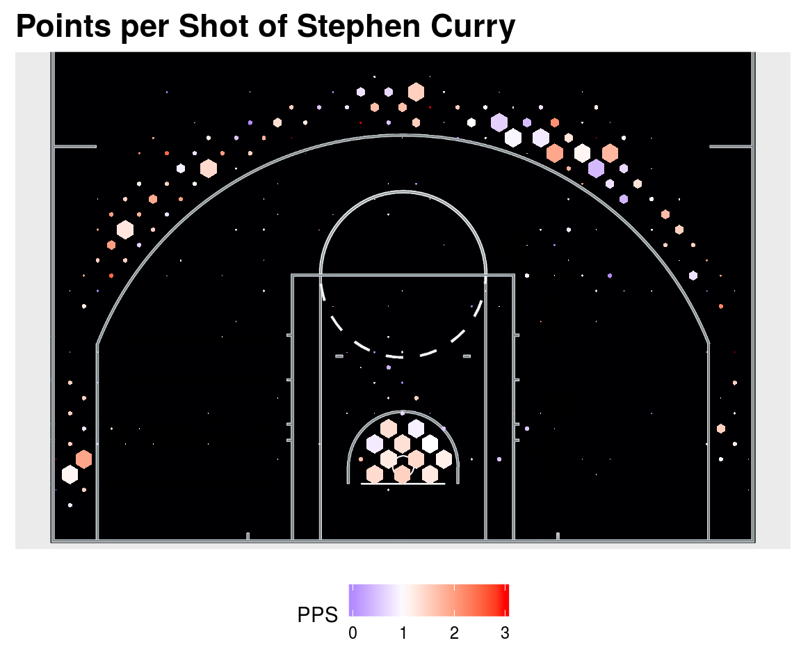
Figure 1. Shot chart of Stephen Curry
If you change the type parameter from “PPS” (Points Per Shot), which is the default, to “PCT” (Percentage of shots made), the color scale of the hexagon will change to reflect that, as seen in figure 2.
ShotSeasonGraphPlayer(season2017, player = "Stephen Curry", type = "PCT")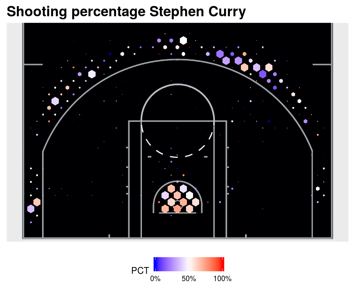
Figure 2. Shot chart of Stephen Curry showing the percentage of shots made
1.1.1.2 Player point shot charts
When it’s eary in the season, or a player does not shot to much, making a frequency based shot chart might not be the best visualization tool. For that, we created the PointShotSeasonGraphPlayer. This function creates a shot chart for a player on a given season plotting a point for each taken shot separating by colors mades and misses, Also, you can add a kernel of the frequency of usage of areas. For example here is the “traditional” shot chart of Kyle Singler (Figure 3).
ShotSeasonGraphPlayer(season2017, player = "Kyle Singler")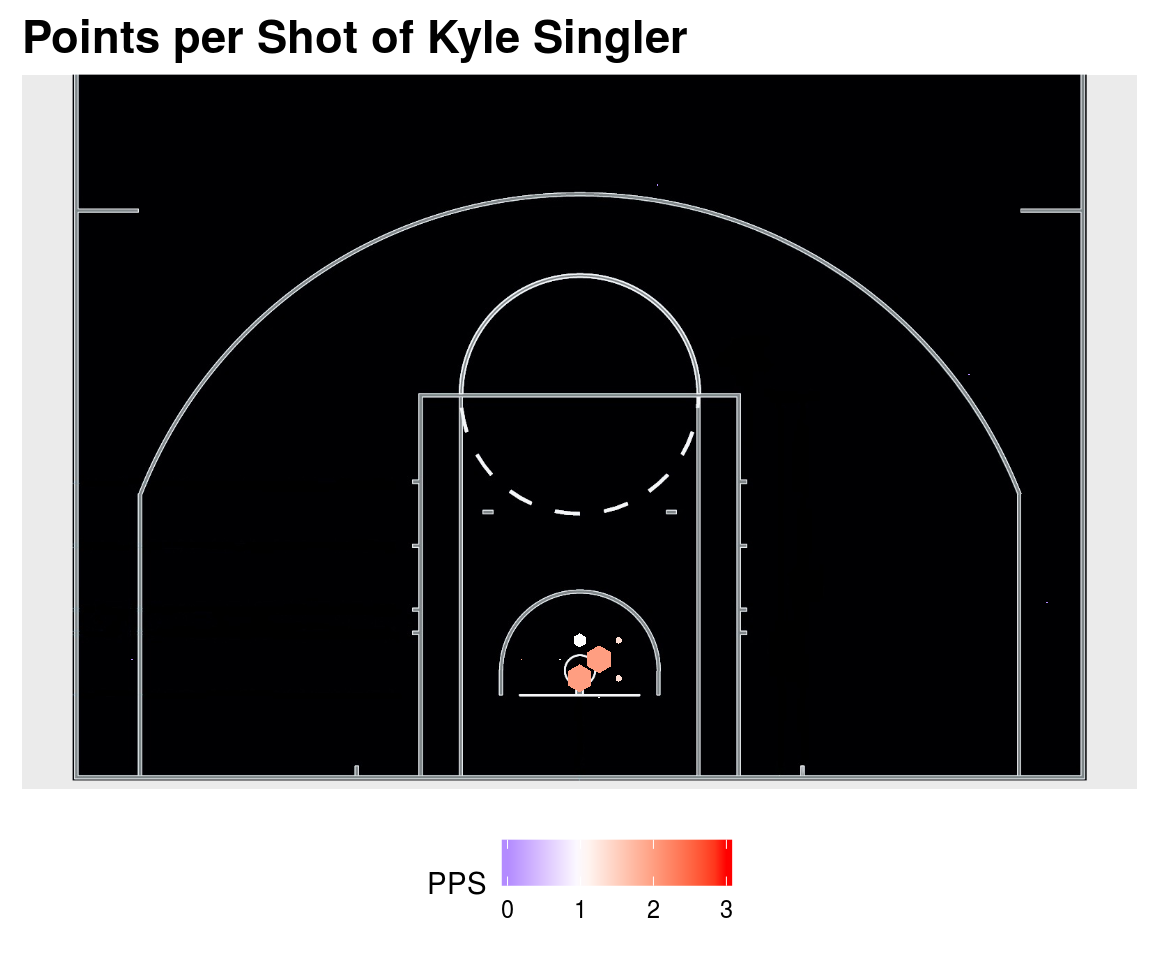
Figure 3. Shot chart of Kyle Singler
He only took 83 shots during the 2016-17 season, in that case, it might be better to plot every shot and a kernel of the most active areas for that player (Figure 4)
PointShotSeasonGraphPlayer(season2017, player = "Kyle Singler")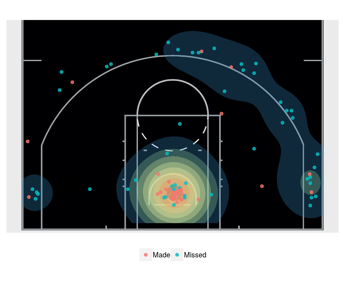
Figure 4. Shot chart of Kyle Singler, point and kernel
We can show only the made shots as shown in figure 5, and/or remove the kernel as shown in figure 6.
PointShotSeasonGraphPlayer(season2017, player = "Kyle Singler", Type = "Made")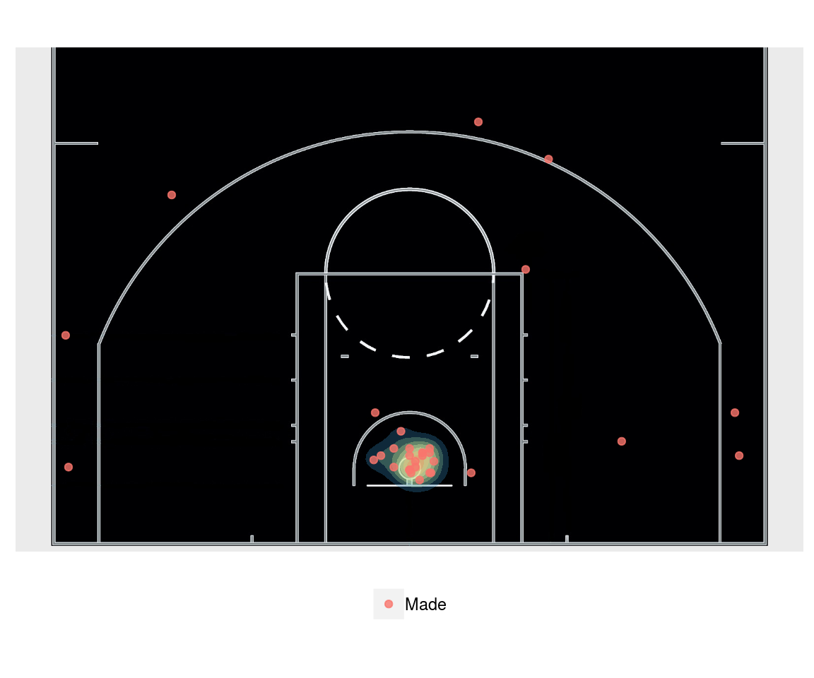
Figure 5. Shot chart of Kyle Singler, point and kernel, only made shots
PointShotSeasonGraphPlayer(season2017, player = "Kyle Singler", Type = "Made", kernel = FALSE)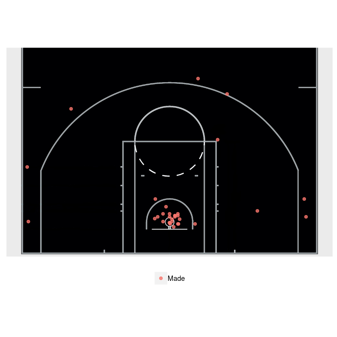
Figure 6. Shot chart of Kyle Singler, points only, only made shots
1.1.2 Team level visualization
1.1.2.1 Offensive shot charts
This shot charts are made from the shots that the selected team has taken. The function to make team offensive shotcharts is OffShotSeasonGraphTeam, where in the most basic option for this function, you only have to provide the Seasondata and the team parameters. As an example of these, lets plot the offensive shot chart of the Golden State Warriors from the 2016-17 season with the data included in the package.
data("season2017")
OffShotSeasonGraphTeam(season2017, team = "GSW")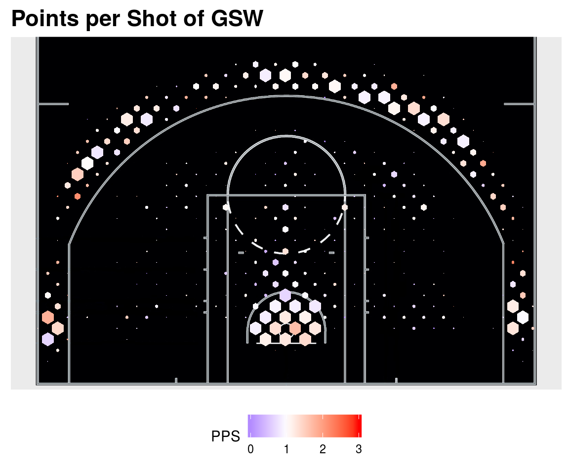
Figure 7. Offensive Shot chart of the Golden State Warriors
A we saw, the default graph has a color legend that varies according to the points per shot (PPS) of the team. This can be changed by changing the type parameter from "PPS" to "PCT" as follows.
data("season2017")
OffShotSeasonGraphTeam(season2017, team = "GSW", type = "PCT")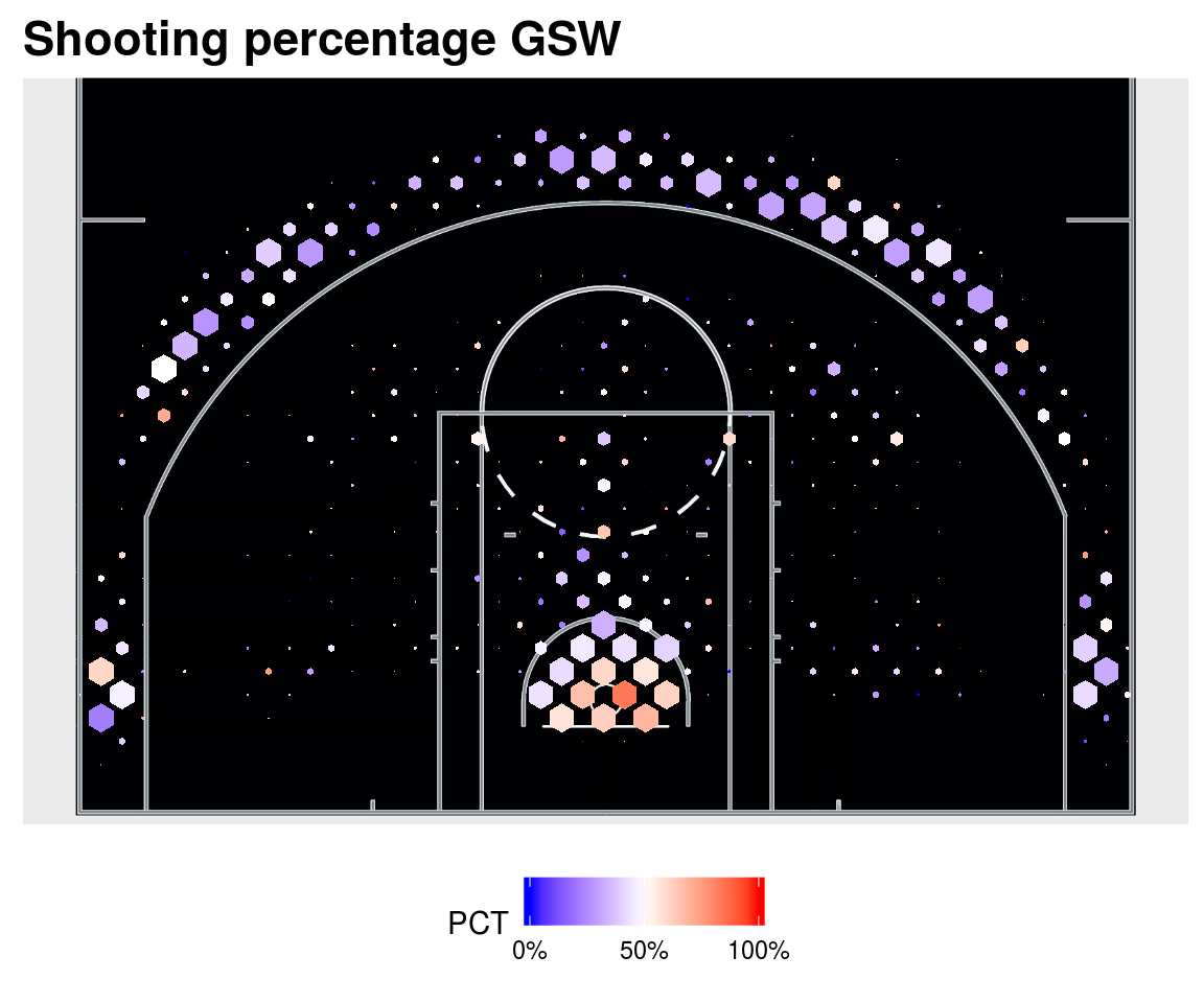
Figure 7. Offensive Shot chart of the Golden State Warriors, percentage of shots made
1.1.2.2 Defensive shot charts
Similar to the offensive shot charts, here we visualize the Points per shot or percentage allowed by the team we choose to graph, using the function DefShotSeasonGraphTeam. Similar to the functions OffShotSeasonGraphTeam and ShotSeasonGraphPlayer, this function allows the user to choose to visualize the shot chart with a Points per Shot ot Percentage scale as seen in figure 8.
data("season2017")
DefShotSeasonGraphTeam(season2017, team = "Sas", type = "PCT")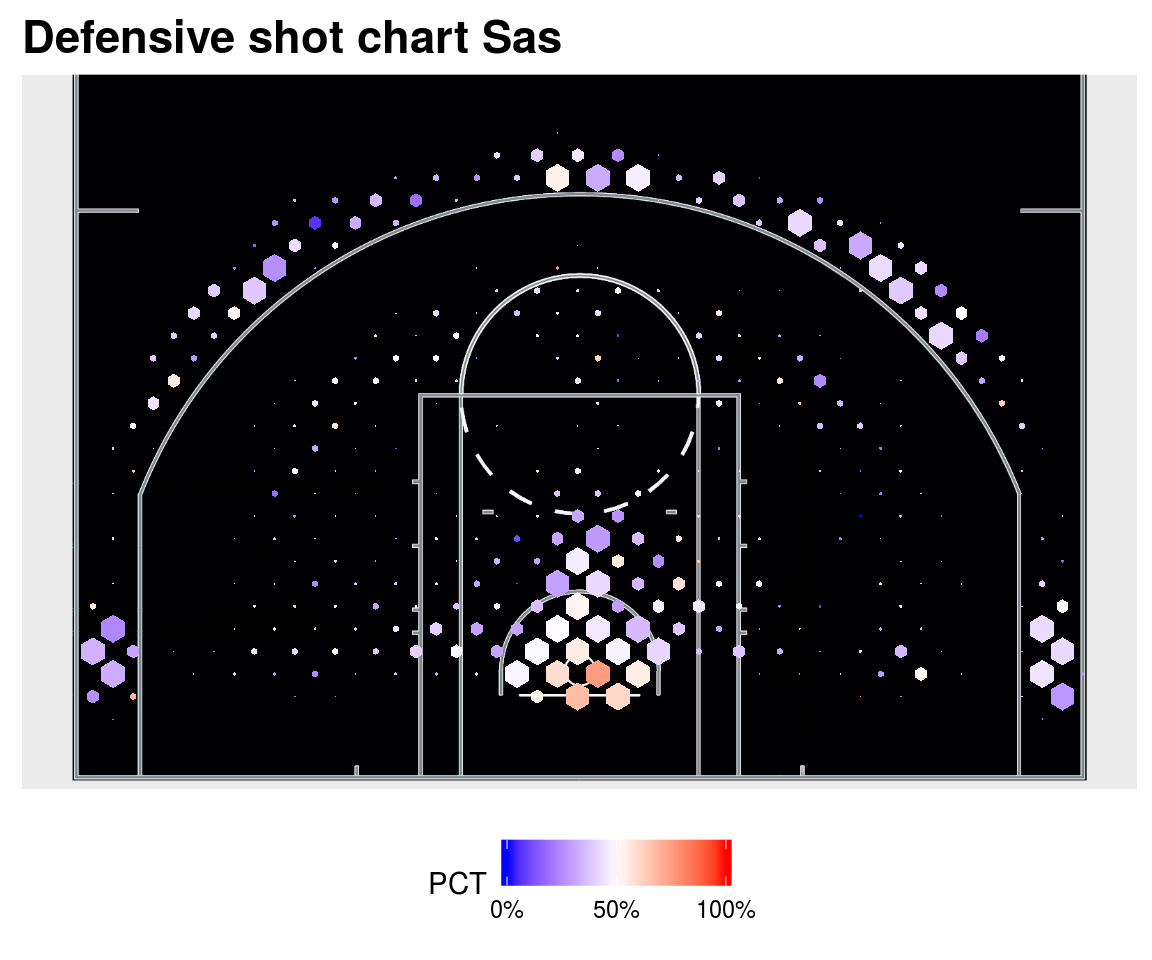
Figure 8. Offensive Shot chart of the Golden State Warriors, percentage of shots made
1.1.3 League level visualization
The ShotSeasonGraph function takes an NBA season object and makes a shot chart of all the shots takes through that regular season. You can choose to either plot the results based on Points per Shot or on Shooting Percentage, as in all previous functions. This function is exemplified in figure 12.
data("season2017")
ShotSeasonGraph(season2017, quant = 0.4)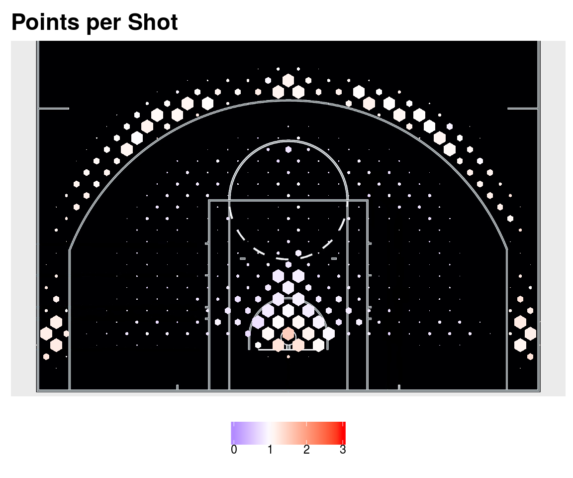
Figure 12. Shot chart of the Whole 2017 Season
Copyright © 2017 Cienciaustral, Inc. ![]() All rights reserved.
All rights reserved.